The Graphic Design of Severance: A Masterclass in World-Building for the Chronically Online Designer
If you're a graphic designer with even a shred of good taste, you should be obsessed with Severance.
Not just the eerie, mind-bending story or the existential dread it injects straight into your veins, but the entire aesthetic of the show. Every frame is meticulously crafted, from the unsettling corporate minimalism to the foreboding geometry of the landscape around Lumon Industries. If you haven't already spiraled down a visual analysis rabbit hole, let me ruin your productivity for the rest of the week.
Typography That’s a Little Too Friendly (and That’s the Problem)

Let’s start with the typefaces. The use of retro style fonts isn't as friendly as they want to seem, it's giving major Fallout and dystopian vibes. & The Lumon logo itself isn’t just a wordmark; it’s a passive-aggressive psychological weapon. That clean, unassuming sans-serif? It reeks of corporate wellness propaganda. It’s the same energy as HR sending out a "friendly reminder" about unpaid overtime with a smiley face.
And then there’s the droplet. What is it? A tear? BLOOD? The essence of individuality being drained from all of the severed employees? The fact that we don’t know (and likely never will), makes it perfect the perfect symbol to represent this mysterious, but important company.
Lumon’s typography extends beyond the logo. The whole company brand design feels like a relic from a timeline where Helvetica won the war and became a cult leader. The signage, the computer interfaces, even the bizarrely sterile office labels, everything looks like it was designed by an AI trying to replicate 1970s corporate optimism, but it keeps glitching into something deeply sinister.

Set Design: When Interior Designers Hate You Personally
The Severance office layout is anxiety incarnate. The endless white halls, the ominous overhead fluorescents, the aggressively symmetrical furniture... it all feels like it was designed by a malevolent IKEA catalog editor.
Nothing in Lumon feels warm or welcoming. It’s a world designed to keep you in a state of unease. Even the green carpet, a rare splash of color, isn’t comforting. It’s that weird corporate green that feels nostalgic and dystopian at the same time, like you’re trapped in a 90's Windows screensaver that won’t let you wake up.

SEVERANCE WINDOWS WALLPAPER DOWNLOAD ($0.99)
Then you have the "break room," which is just a conference room with the vibes of a cursed confessional booth. You will apologize. You will be sorry. You will read the script and mean it.
And let’s not even talk about the Goat Room. That’s a whole separate dissertation waiting to happen.
World-Building: How to Creep Out Your Audience Without Saying a Word
If you're a designer or filmmaker, Severance should be your blueprint for world-building through visual storytelling. Everything about Lumon screams meticulous control, from the way employees are dressed (identical but slightly off-kilter) to the eerily sterile breakroom mugs that look like they should say "World’s Best Dad" but instead just reinforce corporate jargon.
The show’s use of color theory is also just straight-up villainous. The Outie world is full of muted tones, washed-out blues, and dim lighting... cold, distant, almost dreamlike. But inside Lumon? It’s green carpet, white walls, and an endless sea of oppressive fluorescent lights. It’s a space designed to feel like time itself has been erased.

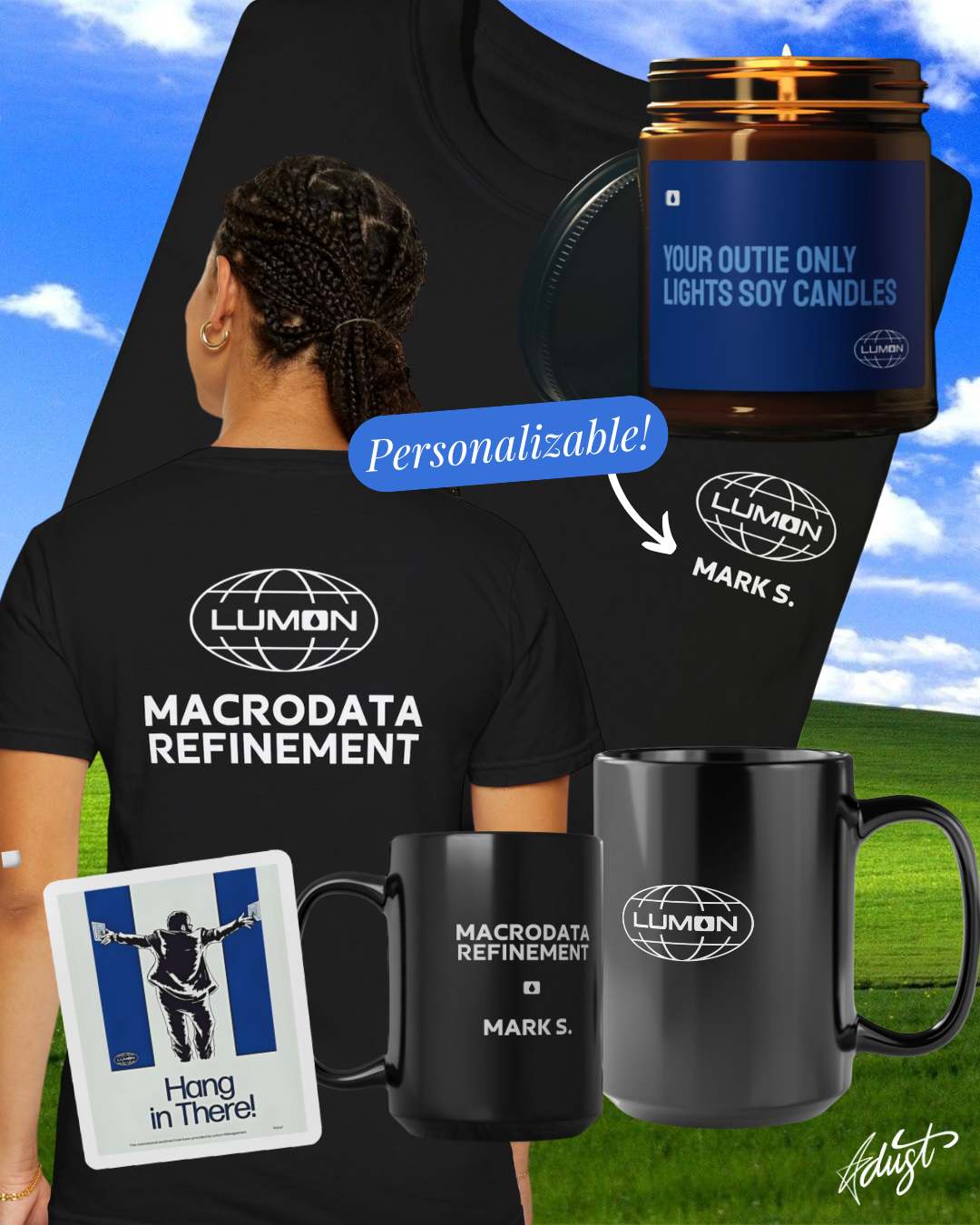
PERSONALIZABLE LUMON INDUSTRIES TEES & MUGS
And speaking of erasure, let’s not forget the subtle nightmare that is the orientation video. Who thought it would be a great idea to combine grainy, low-resolution footage with a script that sounds like it was written by a cult leader on Ambien?
Design Takeaways (or How to Make Your Work Feel Like a Slow-Burning Psychological Horror Film)
If you’re working on a project that needs to feel just slightly wrong, here’s what you should steal from Severance:
1. Use color to manipulate emotion. If you want your audience to feel trapped, drained, or existentially confused, stick to controlled, repetitive color schemes. Think washed-out blues for detachment (ahem, Meta), eerie greens for corporate oppression, and stark whites to erase all sense of identity.
2. Geometry matters. Symmetry can be comforting, but when it's too perfect, it becomes deeply unsettling. Think about why Lumon’s offices are so perfectly rigid. It’s about control. The moment something breaks that symmetry, it becomes an act of rebellion.
3. Typography is a weapon. Want to make something feel passive-aggressively dystopian? Use an overly friendly sans-serif in ALL CAPS. Want to create mystery? Reduce a brand’s logo to a single unsettling symbol (like, say… a droplet).
4. Silence is loud. Notice how Severance uses emptiness - in its sound design, its visual framing, even in its dialogue. The best way to make your audience uncomfortable isn’t to overload them; it’s to take something away and let their brain fill in the gaps.

Final Thoughts: The Aesthetic of Doomscrolling Your Own Life
At its core, Severance is a masterpiece in psychological manipulation through graphic design. Every frame feels like it’s gaslighting you. Every visual element is telling you, in its own polite, corporate way:
"You’re not supposed to be here. But there’s no way out."
Which, honestly, is a pretty accurate summary of being a freelancer with a dozen unfinished projects and a vague but constant sense of dread.
Now, if you’ll excuse me, I have to go emotionally prepare myself for the finale & next season, where I assume everything gets worse in the most beautifully designed way possible.